-
Strategy & brand positioning
-
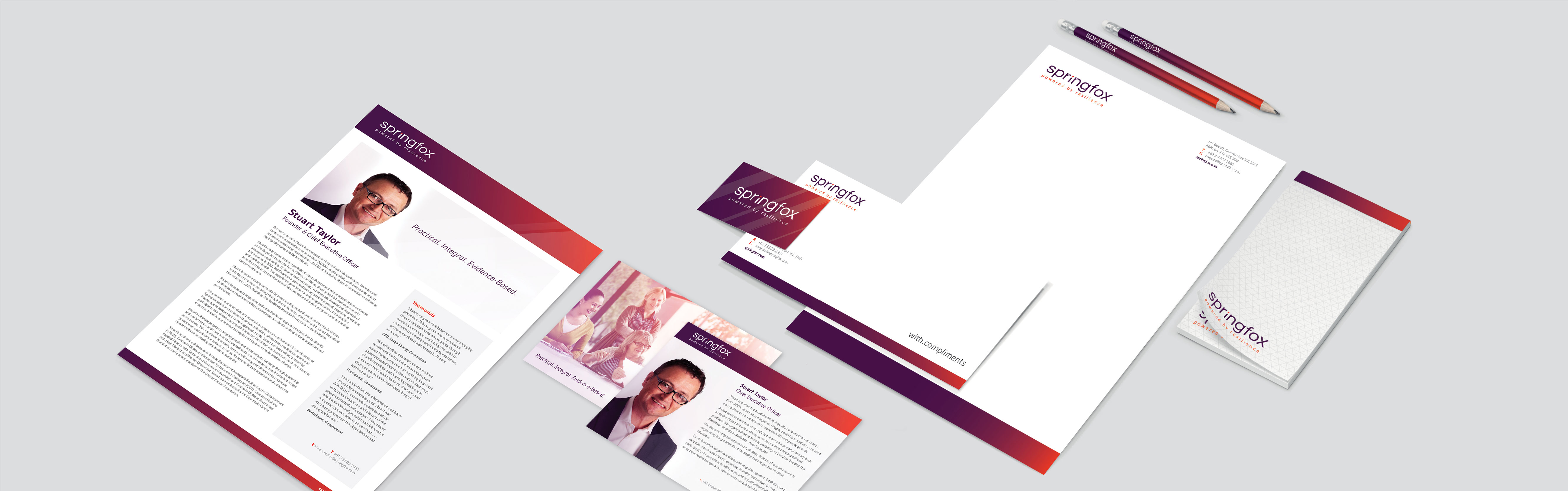
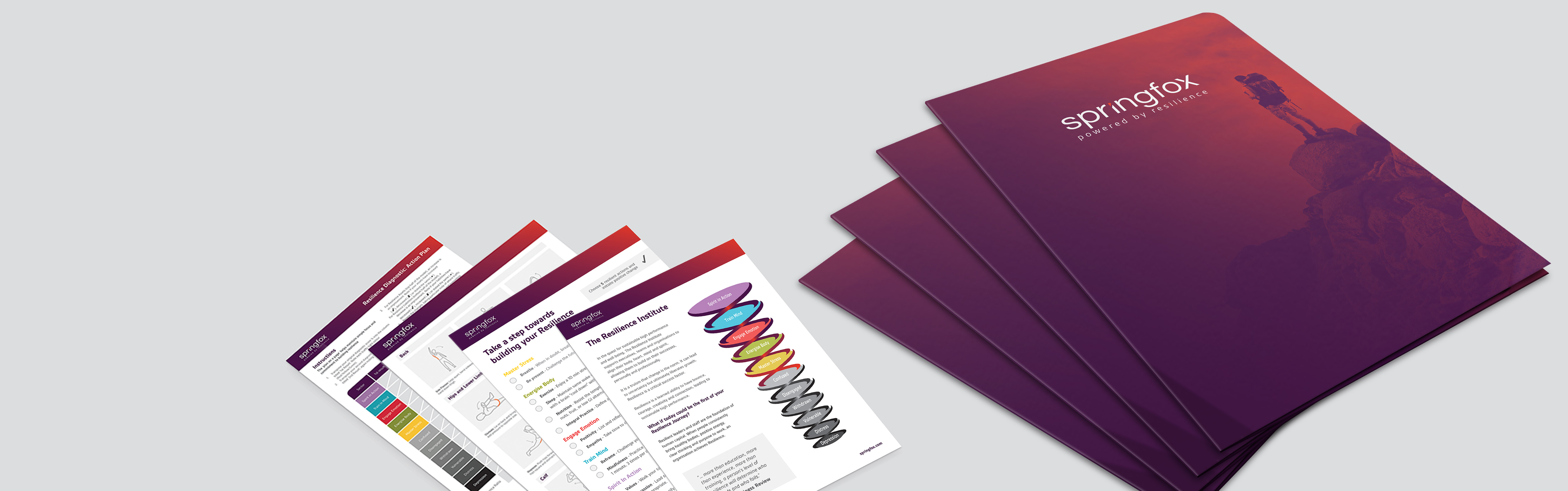
Print : stationary / brochure / packaging / point of sale / marketing collateral
-
Photography & art direction
-
Digital : website design & development / email marketing / social media / content creation
-
Videography
-
Analysis & reporting
-
Strategy & brand positioning
-
Print
-
Digital
-
Photography & art direction
-
Videography
-
Analysis & reporting
the brief - THINK FIRST
Every project comes with its unique challenges.
The Resilience Institute in Australia approached WOOF to find a partner to help them rebrand and relaunch in Australia. The Australian business needed to develop a distinct brand to differentiate itself from the international organsisation and to better encapsulate their ever expanding business offering whilst keeping them ahead of the highly competitive Australian market.
The key to successfully completing this project came in truly understanding not only what they did, but how they were different to their competitors.
In order to comprehend this, we were lucky enough to be able to go through the Resilience Diagnostic and take part in numerous workshops. As a result we were able to actually experience what was being taught, and how it effects our work and home lives. Which leads to greater insights when working creatively to capture the essence of the brand and business.
During the discovery phase of this project, key insights came to light around sustaining and accelerating human performance through improving resilience. Inspiring change that leads to positive action. Formulated on an evidence based approach. This formed the cornerstone of our understanding on the brand and its target market.
Evidence - inspire change - take action - accelerate & sustain human performance.
rebranding approach
WOOF’s approach to naming a brand works from Meaning to Name. When creating a brand and picking a name, it’s often easy to confuse finding a name with meaning and finding a name that can stand for your brand meaning.
The brand beliefs came through loud and clear when talking to any one of the team members. Through their own personal life experiences they truly believed that they could overcome any hurdle that life threw at them and through resilience, not only could they overcome, but they knew they could thrive off life’s disruptions.
Our brand needed to encapsulate these essences - inspiring change, taking action, thriving off life’s disruptions.
The challenge here was in finding the right name. We knew that our customers would search for “resilience” in order to find us or one of our competitors. We needed to incorporate the word in order to maintain SEO, a link to our incumbent name and relevance. However, the market was saturated with numerous business who all had resilience in the name, therefore leading to a bland market. Our research told us that the name had to stand out in a marketplace of sameness.
The strategy suggested that the name we picked had to create a void in the customer’s mind. A void that allowed the brand to impart it’s own meaning on the name. The key was finding the right mix of void and familiarity. If the name had too much of an inherent meaning, our brand position would never take ownership of the words. If the name was totally unknown, there would be no basis for an emotional connection, resulting in a loss of familiarity and memorability that could only be overcome with excessive media spend to educate the consumer.
Inspired by the combination of growth, development and our client’s own personal ability to adapt, thrive and spring forward off any obstacle life threw at them. Springfox was created. Powered by resilience.
a period of change
The incumbent brand was well established within the market. We therefore needed
to create a transitional period, where the new brand could come to life and slowly take the place of The Resilience Institute in Australia.
underlining meaning
Angled lines were used to reflect the essence of action and movement in our brand. Leaning forward. Tilting into the future. Springing forth. These lines break the i and x but form part of the whole, just as the action we take must be done within the boundaries of society and culture, not breaking away from them. Forward angled lines formed the repeating theme throughout the collateral, subtle but meaningful.
meaning in colour
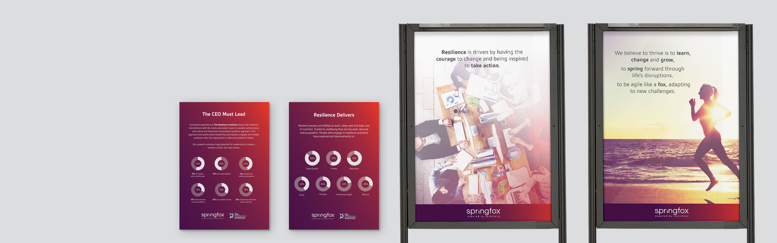
Colour is a powerful emotive visual stimulus. The colour selection for this brand had to relate to the previous brand, stand out in the market but also inspire. Using the oranges and reds from spring to signify change and creativity, and deep purple blue to signify trust, stability and quality of our service.

we believe
Our brand and everything it is, revolves around our beliefs. It makes us who we are, and guides our decision making process.
developing a clear brand Identity & visual language


website approach
The website was the perfect opportunity to dive deeper into the data that drives Springfox’s evidence based approach to resilience and to showcase their tangible point of difference to competitors.
The data is supported by a clean, user friendly, responsive design that allows the site to communicate and not overwhelm the user.
responsive experience
The site was designed with a fully responsive interface to ensure the perfect experience on mobile, tablet and desktop. Which was also key to maximising SEO.
iconography
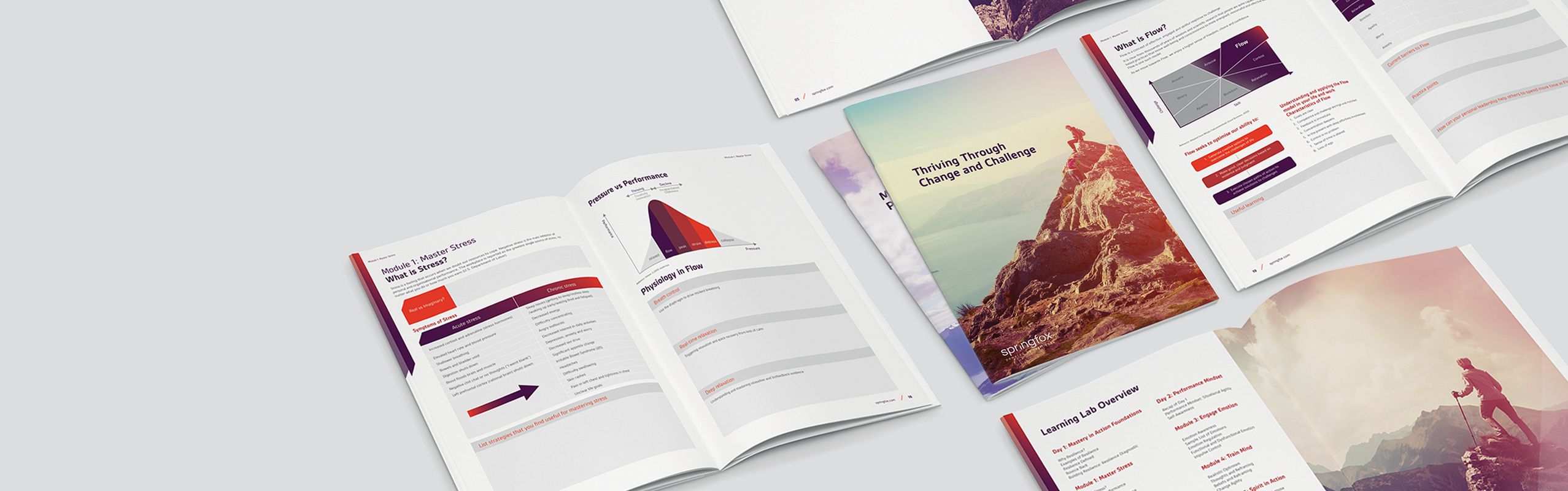
The use of icons & diagrams allows us to simplify complicated concepts whilst creating a visual reference for the user to call on when understanding how many parts fit together. These were then taken and used throughout workshop presentations and workbooks giving users an instant understanding of context.
powerful CMS
Driven by a powerful Drop & Drag Content Management System allows for quick updating and change to design, layout and theme.

the outcome
The ultimate measure of a rebranding projects success is in the tangible result to the business. However, the nature of Springfox’s business model isn’t one of high turn over and sales. It’s one based on client loyalty and relationships, and how the participants receive workshops.
By this measure, to understand if the project was a success we needed to look at how Springfox’s existing clients received the new brand and their feelings towards it as compared to the incumbent brand The Resilience Institute Australia.
The brand was launched with a series of intimate reveal dinner parties in each state. Feedback on the night was overwhelmingly positive...
“Absolutely love it”
“Didn’t see that direction coming, but when I think about it, makes total sense. Well done.”
“Great work guys. Our staff will love this.”
In the time since launch, feedback from participants at workshops has also been positive. Many clients commenting on the fact that the new brand and communications made it easier to get participants involved and excited.
But in the end, for us, the outcome can be measured in our client satisfaction...
you might also like
VIEW CASE STUDY
VIEW CASE STUDY
want to work with us?
want to work with us ?
or call us on
Share this project
© 2017 WOOF CREATIVE